My Role : Product Design, Front End Programming
BACKGROUND
Ethex is a fully decentralized, smart-contract based exchange for tokens on the Ethereum network. Unlike most other Ethereum exchanges, Ethex only lists tokens that are functional and have utility today. Transparency and fairness are at the core of the Ethex experience. Because trades occur wallet-to-wallet, safety is also built right into the system as no middleman has custody of a user's funds.
THE TASK
Given the scrappy, start up nature of Ethex then, design was not much of a focus in product development. As new features were getting tacked on to the product, there wasn't much consideration being given to the holistic experience of how it all worked together. Design debt was building up and a need for a redesign was apparent.
Along with designing a brand new mobile app, I was also tasked with redesigning the existing web app. This meant that I not only had to come up with an experience that felt like the same product across platforms but that this could be built upon as the product evolved.
THE TEAM
I was the sole product designer on this project and I worked closely with the founders, a couple of developers and marketing personnel.
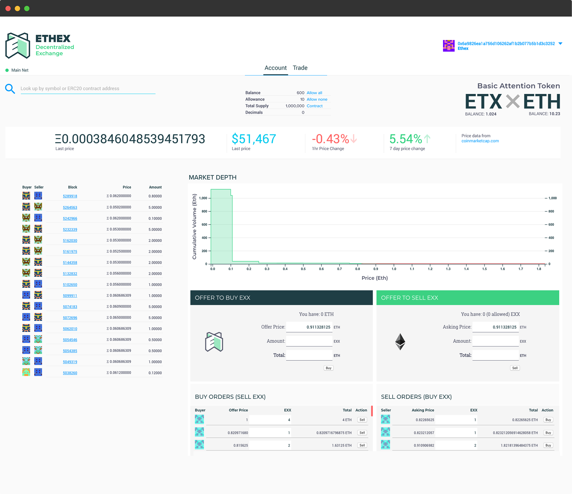
Here's how the app looked before the redesign
The crypto enthusiast community is very active on the messaging app Telegram. The Ethex channel on Telegram was no different. It was the de facto place for Ethex users to connect with other users, air grievances, request features or get support. It was through this Telegram channel that we were able to source users to learn from throughout this redesign process. Given that the platform had a small user base, research was primarily conducted through user interviews, competitor analysis and usability testing throughout the development process.
WALLETS MENU
First step in the process was rethinking the user onboarding of adding a wallet. Although adding a wallet wasn't necessary to be able to use the web app - users could still browse the exchange and view open trades - they would need to add a wallet to be able to make trades.
In the cryptocurrency world, wallets are the place where your currency is stored. Technically, nothing is stored in it - the blockchain itself maintains a record of it all - the wallet is how you access the tokens you own. One of the things that is very unique here is that there is no central authority that issues or manages wallets. Therefore, the responsibility of keeping the private key (essentially the password for your wallet) safe falls on to the user.
This is a critical distinction that many newcomers do not fully comprehend. Moreover, the interfaces that they use to interact with the blockchain don't do a great job of educating them on it.
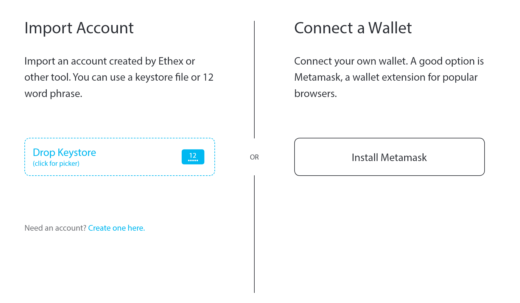
The original wallet addition menu above, while simple and straightforward, was not going to be enough as we expand functionality to support new wallet types. Moreover, I wanted to use this opportunity to not only educate novice and experienced users alike on the importance of maintaining a wallet but also to further simplify the user experience.
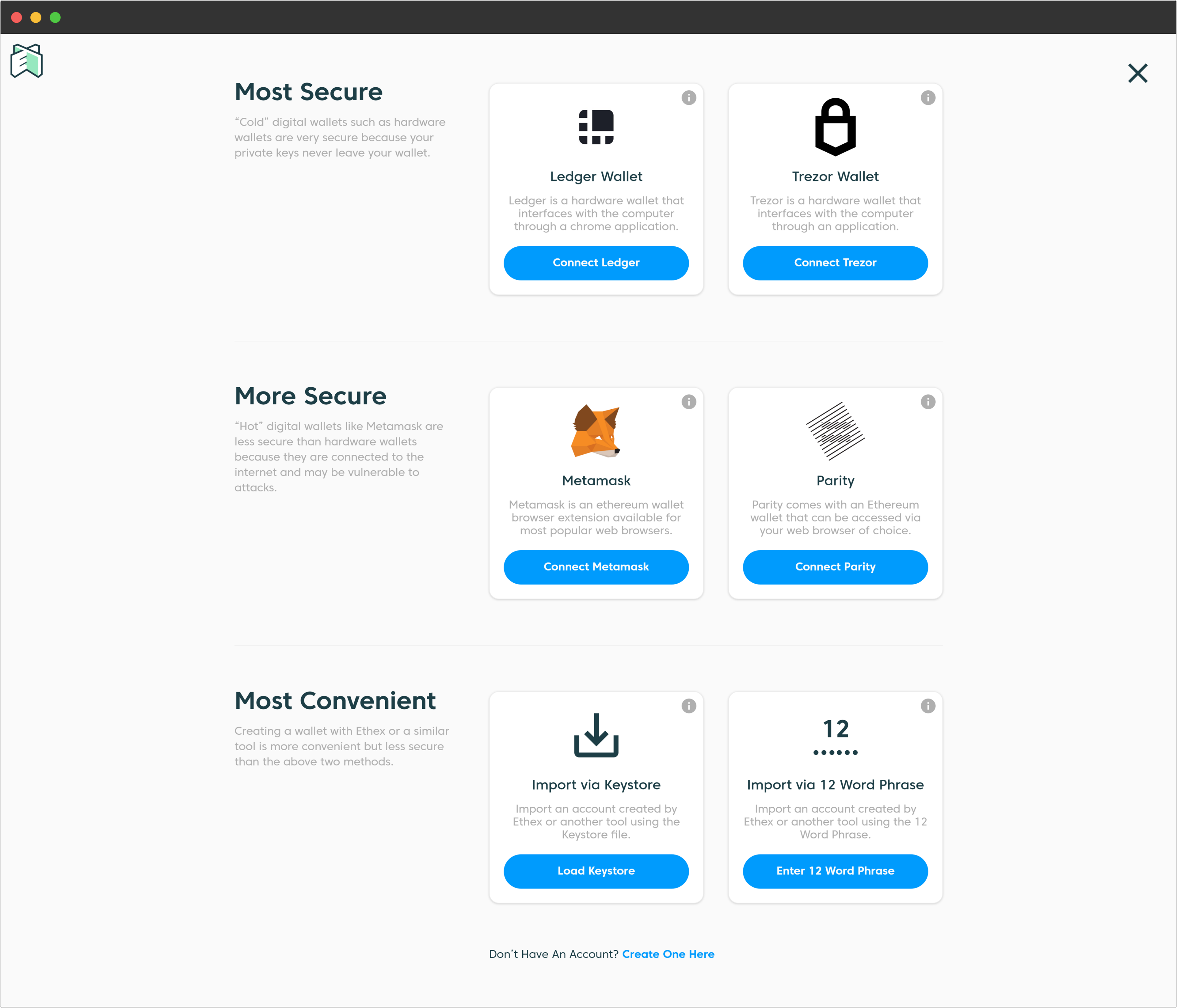
The redesigned wallets menu
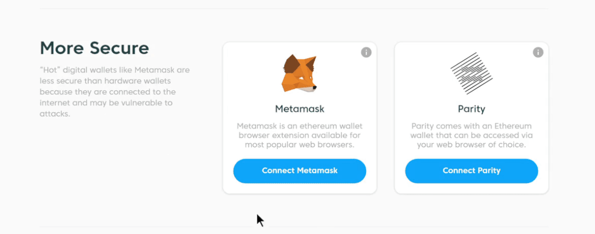
The redesigned wallets menu divides up the available wallet types into sections based on their security level. The most secure ones presented at the top while the less secure ones at the bottom. Moreover, the user flow for adding a wallet is housed completely within each card.
While we considered other designs for this like a simpler list view, the card based model was the most intuitive and flexible one which served our needs better.
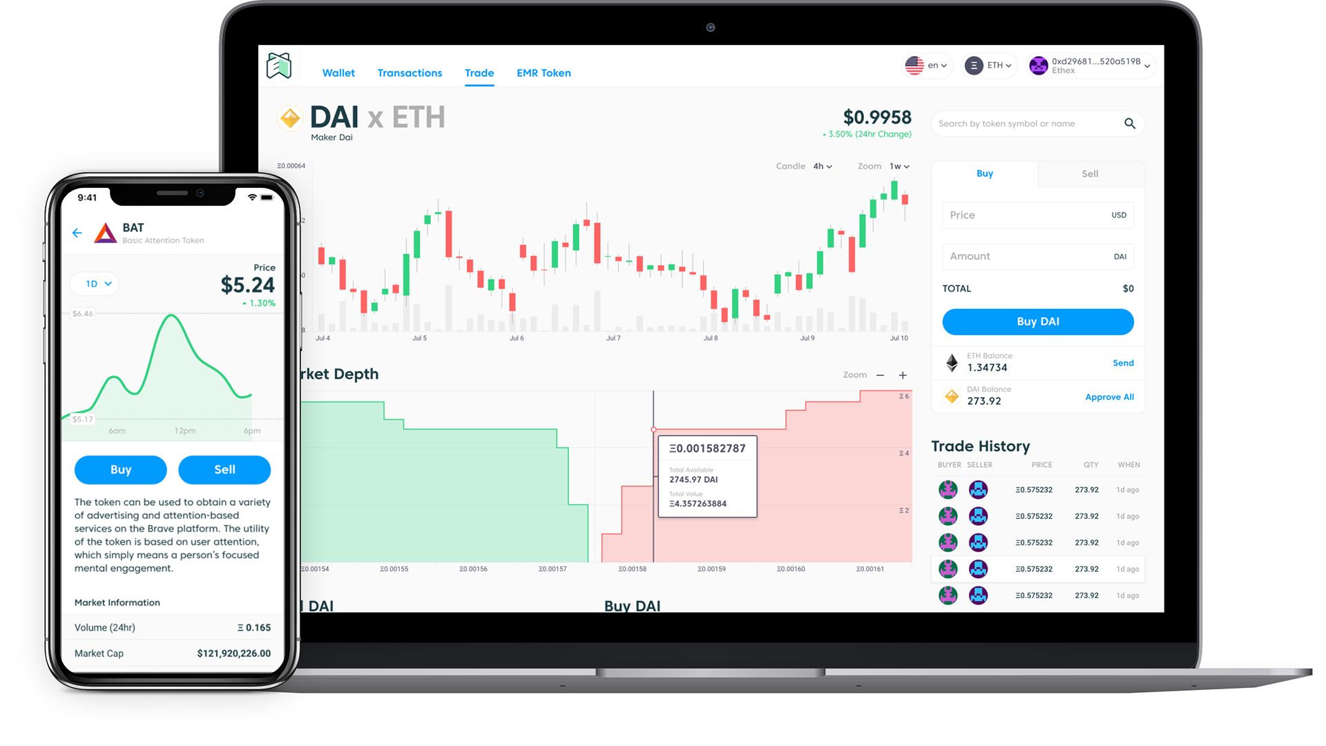
TRADING INTERFACE
The trading interface was something we heard a lot of gripes about from our users - in regards to both form and function. The arrangement of the buy/sell order forms and order books that goes against a user's mental models, the excessive amount of information presented that made it harder for users to get things done, the uninformative transactional processes were all just a few of the critical things that needed to be redesigned.
I systematically worked through to realize what was important information and what wasn't while simultaneously iterating on the structure and layout to get to something that worked much better for the users. Given the startup nature of Ethex, several compromises had to be made along the way due to technical and business restrictions.
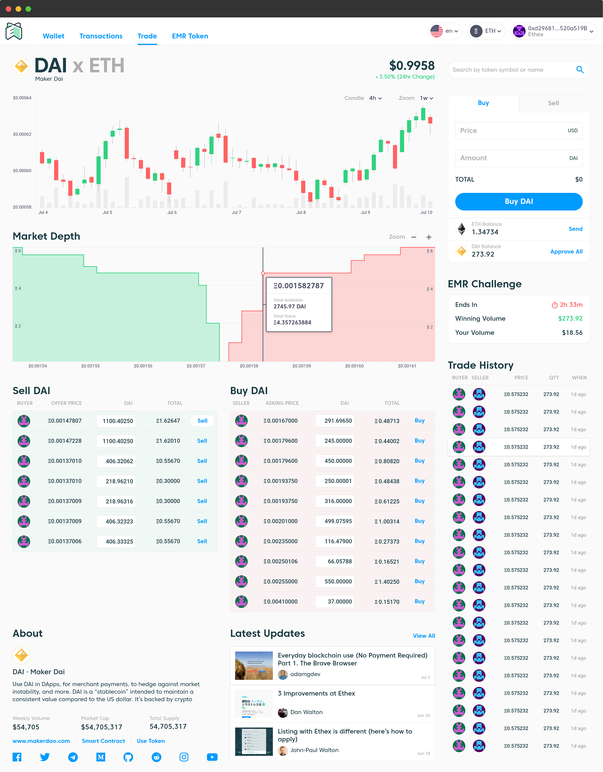
After the redesign
By separating the buy/sell order forms from the order books and combining them into a unified quick order box, much of the confusion from the previous layout was eliminated. Moreover, moving the quick order box above the fold ensured that buy/sell were the focus of the trade page and the singular call to action.
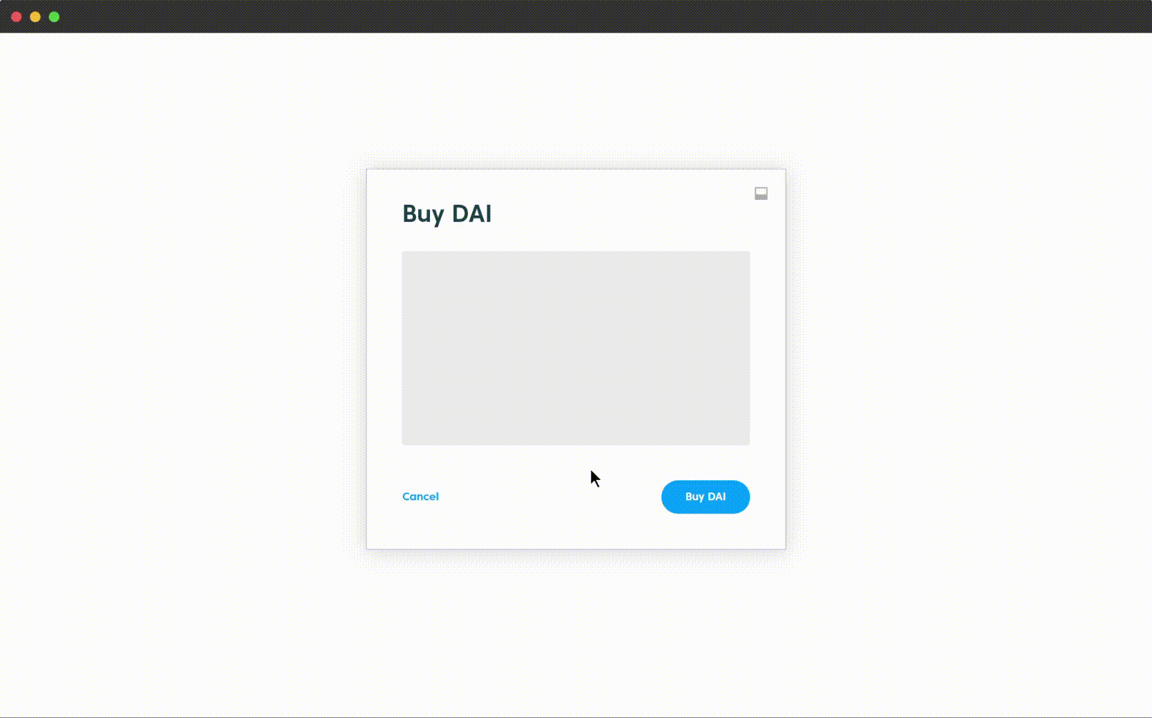
The redesigned transaction system
Once a transaction was initiated, users were practically in the dark until it finished. They had to jump through multiple hoops to be able to verify the success or failure of the transaction. While a lot of this disconnect had to do with the technicality of how transactions on the blockchain worked, careful design considerations would have mitigated the issues.
We ended up redesigning the whole transaction process to be more informative, more flexible and more reproducible. Transactions are visualized in a dialog box that keeps users informed throughout the lifecycle of the transaction. The dialog box can be minimized into a dock at the bottom of the screen allowing for multiple transactions to be initiated and tracked simultaneously. This new design was a marked improvement that was widely appreciated by the users.
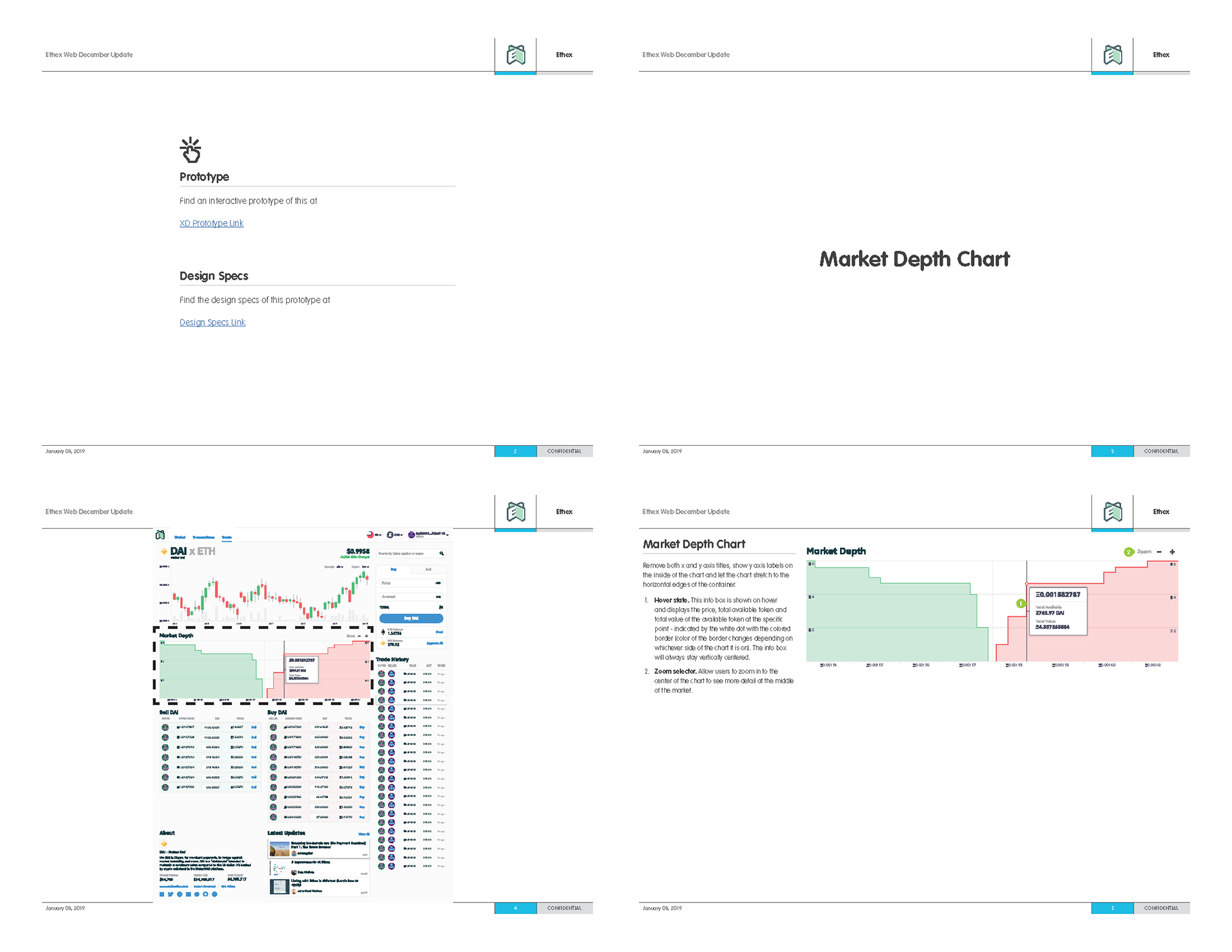
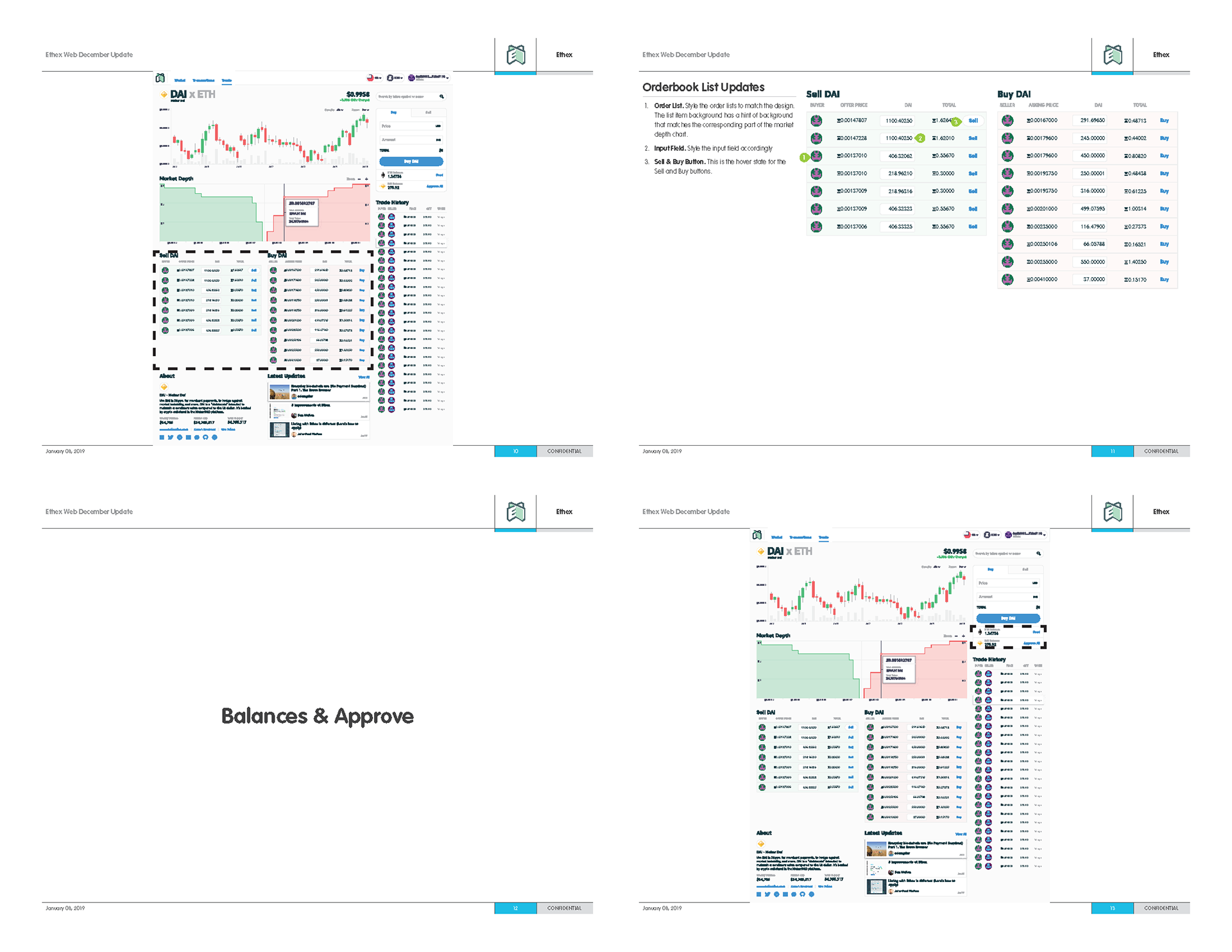

Many design spec docs, like the one previewed above, were created to aid the developers. Given the complexity of the blockchain space, there were many things that we were discovering and learning as we went through the process. Hence, close communication with everyone involved was a necessary element to ensure development stayed on path. Documents like this were an integral part of that.

There were plenty of cross-learnings as I went through the design process and usability testing for both platforms that made the overall experience better.
All of this was done ensuring a cohesive look and feel on both web and mobile. Moreover, I also got my hands dirty by implementing a lot of my designs on the web with HTML and CSS. The web app was built in React, a technology I've never worked with so it was a fun learning experience.